

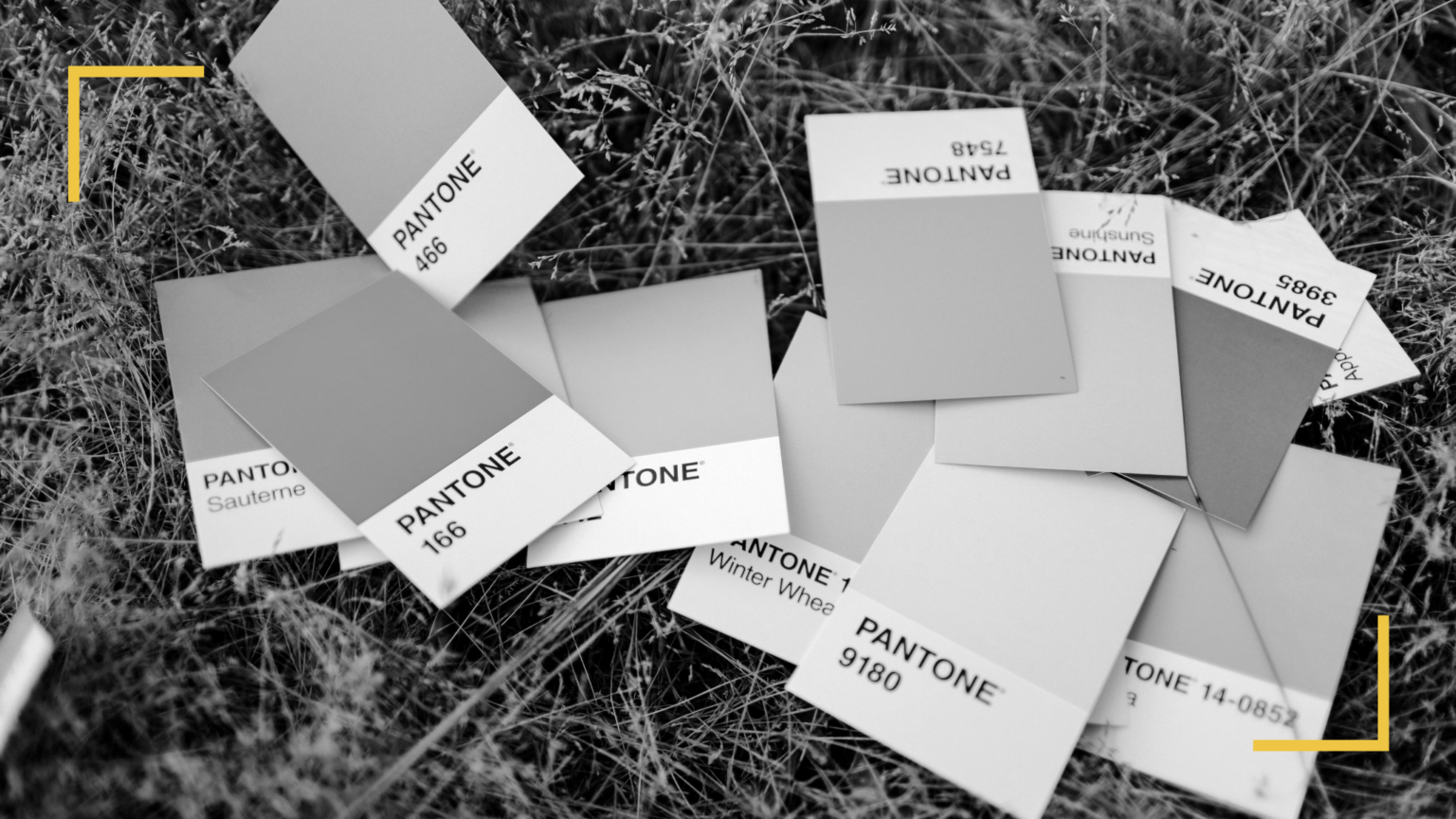
How to choose the right colours of your graphic charter?
We are fundamentally influenced by colour. In each aspect of our daily life, the presence of colour impacts our way of being, thinking and feeling our environment. From a marketing point of view, for more than 50 years, we have known to what extent colours are important. Whether it is for the appearance of products, their packaging or the aesthetics of the brands themselves, nothing should be left up to chance. In a previous article, we explained how to create a strong brand image and how important it is. Here we are going to talk about a very particular aspect of this brand image, namely colour.
Colour is the most important memory criterion of a visual, well before its form or content. Colours are the first to be seen and the ones that strike our memory most quickly. Their importance is therefore crucial in a professional context. This is why it is essential for a brand to work well with them and to put in place a graphic charter as well as a relevant and striking logo according to its activity. This article gives you the keys to better understand how we perceive colours and what associations may be the most judicious if you are looking to conceive a graphic charter or a logo for your brand.
Table of contents
1. What colours inspire in marketing
Colours are not neutral. In spite of personal preferences of everyone, this sensitivity is not just a matter of marketing. Indeed, throughout human conditioning, colours have been integrated as signals to answer certain requests in our environment. Colours codes, dangers, nature, etc.; we spontaneously associate them with activity sectors or qualities that are unique to them.
“80% of a colour allows an Internet user to identify a brand.” (Source: J’optimisemonsite.fr)
When you are looking to design your graphic charter, your logo and even your visuals, the objective is not to design visuals with colours corresponding to your own taste. On the contrary, you should opt for colours that are in line with your field of activity and the values you wish to reveal of your brand while keeping in mind the colours your target audience appreciates. The choice of colours matters, as each one shows specific symbolic content and their intensity, as well as their attractiveness, vary greatly. There are 4 elements to take into account concerning colour and its importance in marketing: visibility, preference, colour code and evocation.
Visibility
Colours are not all perceived in the same way. Not only does the intensity play a role; obviously a bright green will stand out more than a pale green with a lot more diluted colours, but the colours themselves are important.
“Colour can increase a logo’s understanding by 73% and its notoriety by 60%.” (Source: olybop.fr)
Be aware that beyond the different pathologies that influence the perception of colours, these are not perceived by the eye at the same intensity. For example, a blue surface and a yellow surface of the same dimensions are not considered equivalent. For the same surface, yellow will be seen as the most intense colour. A yellow product will need less surface area to get noticed. On the contrary, for a blue product to have the same impact as a yellow product, it should occupy a surface area 2,7 times bigger. It is therefore important to know if the colours you choose are naturally visible at a glance.
Preference
Just as you may not have the same taste as your neighbour, you will be even less able to agree with the whole of Belgium, Europe or even the World on your preferences. However, there are studies which, on a large scale, have shown that there are nevertheless trends in colour. In 2017, a study conducted by the English paper manufacturer G. F. Smith on no less than 30,000 participants in 100 different countries determined THE world’s favourite colour. For the curious, this colour, entitled Marrs Green, is rather cold green, pulling towards blue.
More generally, blue followed closely by green, on a global scale seem to be the two colours on the podium of favourite colours. On the contrary, if we take back our 6 colours, it’s yellow that seems to be the least appreciated. Surprising, as we have just seen that yellow is the most visible and blue the least. Don’t panic though, yellow is not a hated colour. It is simply the one that seems to have the least impact on people’s minds when it comes to having a preference.

The colour code
To avoid making counter-intuitive sense to the human brain, it is often advised to respect the different codes or colour ranges already known and integrated more or less consciously. For example, a colour code going from yellow to purple would have no sense, yet they are complementary as green and red used in the field of dietetics for example.
Evocation
As we have explained, colours are not neutral. They all carry a positive and/or negative symbolic signification that is important to know.
“A study finds, for example, that up to 90% of instant judgements on products are based only on the colour.” (Source: Alioze.com)
Red is associated with love, passion, courage, and dynamism. This is why it is also frequently found on Valentine’s Day, for example. However, red is also associated with fire or even death. We have always been conditioned to be scared of red. The colour of blood and danger when represented, it is a strong colour, both positively and negatively, which suggests action.
Orange is associated with generosity, energy and activity. Although it is a neighbouring colour to red, orange is not associated with anything negative.
Yellow is a solar colour par excellence, often associated with summer and heat, but also with intelligence and youth. It can, however, also express betrayal or doubt.
Green is nature! It is vegetation, rest but also hope. Green, as opposed to red and danger, is also associated with security, but can also suggest jealousy. Furthermore, according to the shades, the impression could be rather negative. A grey-green would be unhealthy, or a green pulling towards blue would be icy.
Blue is associated with tranquillity, confidence and seriousness. It is also widely used to signify hygiene, as in toothpaste for example. Conversely, it can also mean introversion or even secrecy.
Purple has for a long time been a royal colour. Associated with nobility and power, purple is nowadays used a lot in astrology, superstition and mystery.
Black is a timeless, elegant and distinguished colour. The strength of its luxurious appearance suggests premium quality. Much associated with the artistic dimension, the colour can nevertheless signify the unknown or death.
White is purity, perfection, and innocence. Beware of falling into the void or the unreachable which can also be associated with it.

2. What colours suggest psychologically
As well as their marketing signification and associations that are handed over to them, the colours that surround us also affect our behaviour. According to neuroscientists, colour unconsciously impacts our perception of things, our mood and our attitude. Marketing is not an exception! Used correctly, a colour can transmit a specific message and generate different feelings, sensations or emotions.
Jean-Gabriel Causse, designer and writer of the book “L’étonnant pouvoir des couleurs” reminds us that colours have a direct influence on morale and even productivity. Indeed, according to the chromatic atmosphere in which you work, you will not have the same energy. A hot chromatic atmosphere will, for example, allow you to stay concentrated a lot longer. Whereas a blue or green chromatic atmosphere will, on the contrary, accentuate creativity. According to the colour chosen, psychologists manage to say that they will not have the same effect on you. The simple fact of giving information about a certain colour influences the way we perceive it.
In the 1950s, the society Procter & Gamble wanted to know if the colour had an incidence on their detergents, so they decided to have a panel test 3 different coloured detergents. Detergents with yellow, red and blue glitter. The test results were surprising. According to the testers, the yellow detergent did not clean enough, the red detergent damaged the laundry, and the blue detergent washed cleaner and smelled fresh. Not one tester noticed that all these detergents were of the same efficiency and that the colour of the glitter did not change the properties of the different detergents.
“It is close to impossible to separate a sensory experience from the environmental effects.” (Source: Blog France TV Info)
Colour has the power to influence judgements about the quality of a product and its taste. The company Intermarché came to the same conclusions in 2018, staged in an advertisement for popsicles.
3. Colour harmony
We have talked about colours and their impact on marketing and psychology, but we have not yet addressed the different ways to associate them. Indeed, it is certainly important not to make a mistake depending on the message you want to convey, but it would be even worse to have a graphic charter and an unaesthetic logo due to poor harmony. Unless you want your logo and your chart to be monochrome, you also need to learn how to associate them correctly. We often talk about complementary colours, accents, touches of colour in decoration, fashion and even marketing, but do you know what colours can really work together?
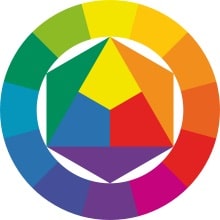
Complementary colours: these are the colours at the opposite of the colour circle. The basic complementary colours are magenta and green, yellow and purple and finally cyan and orange. Complementary colours can be of many others shades according to your position on the colour circle.
Similar colours: these are colours close to the selected colour. Composed of the same primary colours, they fit well together thanks to their shades and visual similarity. For example, green, bluish-green and yellowish-green are found on either side of green on the chromatic circle.
Shared complementary colours: it is a variant of complementary colours. As well as the base colour, it is not the opposite colour that is associated with it, but two colours that are equidistant from the colour opposite the base colour. To make it simple, if your base colour is blue, its shared complementary colours will be an orange a few shades lighter and an orange a few shades darker than the complementary orange. This allows you to add a colour to your palette.
Triads: these are three colours chosen at one third each on the chromatic circle. They are at an equal distance from each other. We find in this way for example the 3 primary colours, magenta, cyan and yellow which are at perfect equal distance on this circle.
The square: just like the triad, the square, as its name indicates, assumes that the colours are chosen at intervals of one-quarter of the chromatic circle.
The rectangle: a variant of the square, you just need to trace a rectangle on your circle. This allows you to have 2 sets of complementary colours, more or less close according to the spacing of your rectangle.
4. Websites to find harmonious colours
After these numerous theories, we are conscious that practice can be scary. The creative process during which you realise a graphic charter and a logo can be long if you dwell on all these details. It can also be hard to find colours that work perfectly. And yes, sometimes theory does not necessarily work in practice. Don’t worry, we are not going to leave you like that. Because we have thought of everything, we have put together a small selection of three tools that will help you find harmonious colours.
Adobe Color
To put the theory into practice, Adobe Color would be perfect for you. A chromatic wheel with pre-established settings to allow you to find complementary colours, triads, squares and many more.
Palette de Couleur
If you are lacking inspiration, Palette de Couleur will be perfect for you. On this website, hundreds of 5 colour palettes are available waiting to be chosen. Simply scroll down until you come across a palette you like.
Color Space
If you do not know how to associate your favourite colour, Color Space is the solution you need. With its amusing and very intuitive interface, all you have to do is select your colour (or a colour you like if you do not have one) and Color Space does the rest for you. Generate harmonious palettes from 3 to 6 colours based on your chosen colour. A piece of cake!

As you will have understood, nothing is neutral in terms of colour: numerous criteria come into play when it comes to choosing them. This article is intended to give you the keys to understanding what the best associations might be according to your needs and desire. It is in no way a recipe to be followed to the letter, but enables to understand what mechanisms are operating in humans when confronted with a colour and how to take advantage of them for your brand.
Colours inspire and evoke all sorts of things, more or less conscious. The average human eye differentiate more than 2 million colours and there are no less than 16,777,216 codes HEX codes for your colours that can be displayed online, so there are an infinite number of possibilities. Between the most appreciated and the most striking colours, the most recognisable ones, the ones that best match your message, you certainly have something to do to find your association of colours. However, the main thing to remember is that there is no basic right or wrong colour, just better associations than others, and there is no need to put pressure on yourself to make such a choice. If you wish to adapt your colours, we hope that this article has inspired you. Don’t hesitate to let us know in the comments what your best associations are, we would love to hear about them!